15th September 2017
The story of the Shine ‘Winners Book’

Shine Deputy Chair Richard Chapman talks about the Shine Winners Book as a case study in a big professional print.
This time last year we were celebrating our nomination for the print industry’s Solutions Awards for print design – our brochure for the Shine School Media project we support had just been recognised in the Environmental category.
This was a real thrill because, as a small agency, we tend not to worry too much about awards. They are nice when they happen (and clients love them) but the whole process of payment and reward from the major prizes has sometimes felt like a bit of a cash cow rather than something that is all about the talent. However, in part because the project we were nominated for was such a personal labour of love for me, this one felt rather different. And then – we won.
Isn’t it funny how winning changes everything? Firstly in terms of how you feel about the work you did. It feels… golden, special, recognised. Somehow it stands apart from the rest of the work this year and becomes more significant. And then, secondly, winning again becomes somehow less critical. It won once, so attained this fantastic standard. Wouldn’t winning again be somehow… greedy?
Well possibly, but we certainly have been nominated again!
Our work for Shine this year has been shortlisted for a Solutions Award in the paper category. I thought it might be worth putting down a little more detail how we made those choices.

- THE MOST SUSTAINABLE CHOICE…
It’s tricky to talk about choosing paper, design and the environmental decisions we make in isolation as the topics are completely intertwined: in particular the choice of materials is so fundamental to the environmental credentials of the work.
So rather than set out different cases here I think it’s important to state from the outset the exceptional environmental credentials of the stocks we have specified here. All have full FSC, EU Ecolabel and ISO 14001 certification. This triple-whammy of accreditation ensures our choice of paper is among the most sustainable on the market.
With that established, I think there’s something distinct to say about the decision of paper stocks from a purely aesthetic perspective. And that part of this story, the fact that we used a variety of papers, was something that rather surprised me…

- A STORY OF SPECIFICATION
From the start of our work this year, ‘our man’ at Denmaur Papers, their Marketing Manager Andy Bruguier, said, “why don’t you use three different paper stocks!” and I confess I was initially unsure. I mean… would I have chosen to use three different stocks if I had come at the project completely anew? And what would be the reason to so now?
Obviously this was Andy’s idea as sponsor and there wasn’t a strict need to do this, but it turns out even a vague necessity is the mother of invention. Alongside my slight obsession with amazing print finishes…
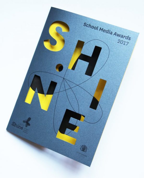
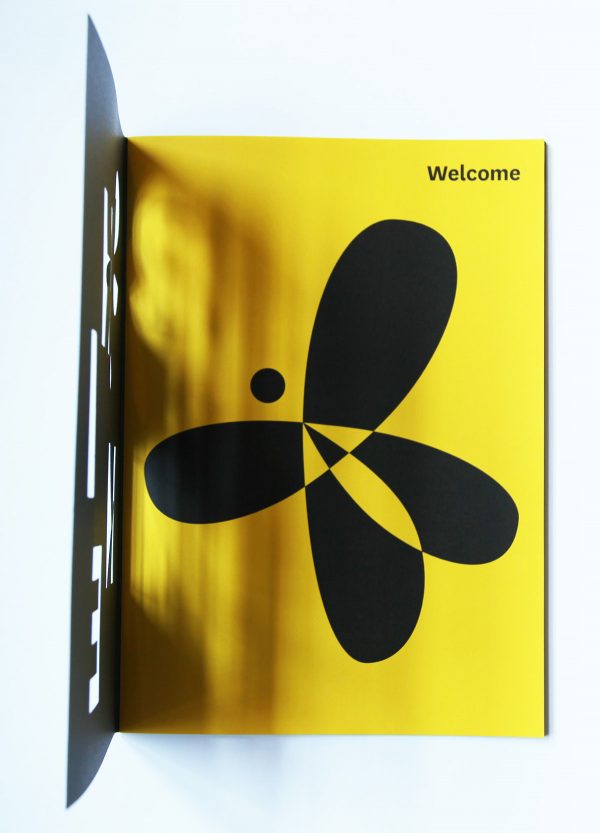
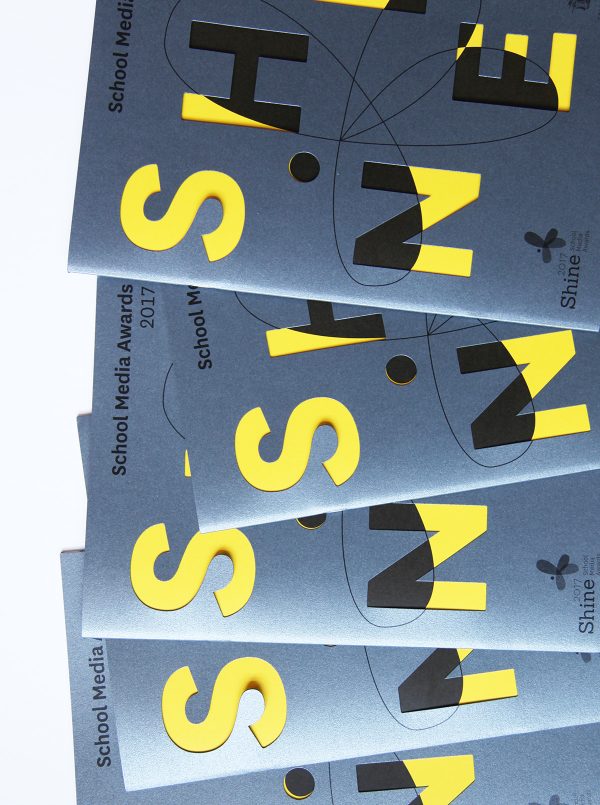
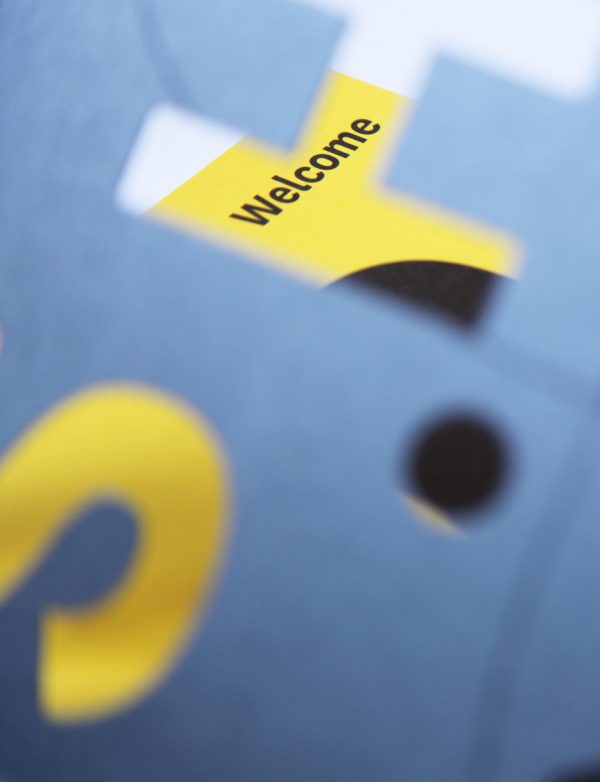
So we came up with the idea of a dark cover of some kind that combined bold, die cut typography with a brightly coloured inner cover that showed through before a big reveal as you open the book. In theory you could do this with print but… we had the opportunity to use fantastic coloured card so… why not?
In the event, both the outer paper stocks ‘shine’ in their own way. Our main cover with the die cut has a sort of irridescent quality to it. Then the inner sheet that shows through is this decidedly sonic bright yellow that provides a duotone feel to the other silver and black elements. This yellow page obviously wraps through the book to the inner back cover too – we used that to highlight a series of special awards and a sparky end-note from celebrity blogger Alice Audley. The end result, ensuring ‘special content’ sits on special paper is that the use paper feels completely considered.
A few formal paper credits for those that like that sort of thing…
We used a silver-grey stock called Dorian Grey from the Fabriano ‘Cocktail’ range on the outside and then ‘Buttercup yellow’ from Colorit as the inner cover. The main body copy is UPM Finesse with a silk finish to give the colours maximum ‘punch’ in the finished print.

- CONCLUSIONS…
The end result has proven to be our most interesting project from a stock perspective in some years.
We’ve not worked with these papers before and so it’s inevitably a step into the unknown. But… it’s been fun. A challenge, something new. Being effectively given a brief by our sponsor has meant a really interesting and diverse choice of papers that maintain the environmental credentials which saw us win that Solutions Award in 2016.
And now? Fingers are well and truly crossed for this year!